類似フォント

作者のメモ

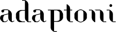
Adaptoni, designed by Rui Batista of FSI FontShop International GmbH, is a free high-contrast serif with broad, sculpted curves and razor-thin joins. Its broken strokes give the letters a crisp, cut-paper quality.

Packaging can use that mix of elegance and interruption to suggest a fashion-led or experimental product. The same sharply edited forms suit magazine covers, cultural posters, and music artwork. Their stencil-like gaps are especially apt for projects built around collage, modernist graphics, or fragmented imagery.
タグ

文字マップ

プルダウンメニューから、このフォントに含まれる文字マップを切り替えられます。
基本ラテン文字 - 文字マップ

フォントの基本情報

著作権告示
Copyright rui batista 2010
フォントファミリー
adaptoni
フォントサブファミリー
Regular
ユニークサブファミリーid
FontStruct adaptoni
フルフォント名
adaptoni Regular
名称表バージョン
Version 1.0
ポストスクリプトフォント名
adaptoni
登録商標告示
FontStruct is a trademark of FSI FontShop International GmbH
製造元
http://fontstruct.fontshop.com
デザイナー
rui batista
説明
adaptoni was built with FontStruct

フォントの詳細情報

対応プラットフォーム

プラットフォームエンコーディング
ユニコードユニコード2.0 とオンワード・セマンティクス、ユニコードBMPのみ
マイクロソフトユニコード BMPのみ

フォント詳細

作成日2010-06-16
バージョン1
グリフ数175
emあたりの単位数1024
埋め込み権限プレビューと印刷目的の埋め込みの可
ファミリー分類フリーフォーム・セリフ
ウェイト中程度(正常)
中程度(正常)
Macスタイルボールド体
方向強い左右方向のグリフ、中立も含む
パターン特性定期的に