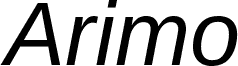
Arimo Bold is a free bold sans serif with a broad, sturdy silhouette, even color, and clean curves that keep the heavy lettering orderly rather than blunt. Its generous inner spaces prevent the forms from feeling packed.
As a firm typographic voice, it can turn wayfinding signs and event posters into direct, highly visible pieces with a contemporary civic character. Packaging and editorial covers can draw on the same weight when product names, sections, or key information deserve assured emphasis. The straightforward forms especially suit public-facing brands, community organizations, transport services, and other work intended for a broad, mixed audience.
Digitized data copyright (c) 2010 Google Corporation.
フォントファミリー
Arimo
フォントサブファミリー
Bold
ユニークサブファミリーid
Ascender - Arimo Bold
フルフォント名
Arimo Bold
名称表バージョン
Version 1.10
ポストスクリプトフォント名
Arimo-Bold
登録商標告示
Arimo is a trademark of Google and may be registered in certain jurisdictions.
製造元
Ascender Corporation
デザイナー
Steve Matteson
説明
Arimo was designed by Steve Matteson as an innovative, refreshing sans serif design that is metrically compatible with Arial". Arimo offers improved on-screen readability characteristics and the pan-European WGL character set and solves the needs of developers looking for width-compatible fonts to address document portability across platforms.