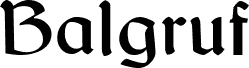
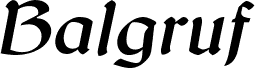
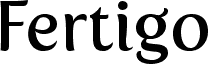
Looking for a font that will add a touch of medieval mystery to your project? Look no further than Balgruf, designed by the masterful Paul Miller. With its gothic typeface and celtic style, this semi-bold font is perfect for adding an air of intrigue to any design. Whether you're creating a logo for a fantasy-themed business or designing invitations for a Renaissance fair, Balgruf will help your text stand out in a truly unique way. So why settle for boring standard fonts when you can embrace the dark beauty of Balgruf?
This is a font inspired by the game 'Skyrim', if you have ever played Skyrim and read any of the books there you may have noticed that the upper case 'F' looks out of place and has a very large right side bearing. It looks like a graphic designer with no typographical experience was given the job of making an F on a very tight deadline and this is what he/she came up with. It seems to be cobbled together from pieces of other characters in the font cut up and glued together.
Once you see this mistake you cannot unsee it. As a type designer I thought I could have done better. So the question arose, how would I have done it. This font is the answer to that question.
As a typographer playing Skyrim by Bethesda I was annoyed by the font used in the books. The upper case 'F' seemed to have been cobbled together from other bits of the font and didn't fit with the aesthetic of the rest of the letters in the font, it also had a right side bearing which was much too large.
As if it had been hastily made by a graphic designer with no experience in typography who was on a strict deadline.
Once you 'see' this mistake you cannot unsee it and it was annoying.