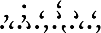
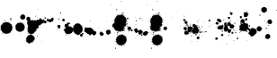
Kzinti by Daniel U. Thibault of Urhixidur Fonts is a free abstract dingbat font of dots, crescents, and hooked teardrops. The smooth, solid marks repeat a curling motion that makes the set feel related. The sparse geometry often resembles a coded alphabet or a sequence of alien signals.
Science-fiction game graphics are its strongest setting, where the symbols can become interface icons or markings on imagined machinery. It also suits merchandise, speculative fiction covers, and electronic music posters. Across them, repeated dots and crescents become signs from invented worlds.
Kzinti.ttf VERSION 2.00 READ ME 27 April 2002 Daniel U. Thibault D.U.Thibault@Bigfoot.com
Well, we've got fonts for nearly every major fictional alien race out there in SF TV/Movie Land, from Babylon 5 to Star Trek by way of Star Wars.
But what of Larry Niven's Kzinti?
I have been able to find only two attempts at pictorial representations of this "dots-and-commas" script. Neither was very pleasing in my opinion, and neither was a font. So I had to make one up.
The two pictures (Kzinti.gif and Kzinti Sample.gif) show my resulting font. It looks best printed (300+ dpi) or at large screen sizes (24+ pt).
Note that the "c" is meant to be a "ch" or "sh", and that there are no Q, X, 8 or 9.
In Larry Niven's Known Space, we learn that the Kzinti script evolved from claw markings in wood. This would influence the script the same way that runes were. Runes were also mostly graven in wood, so they had no transverse strokes --to avoid going across the grain. So I figured Kzinti markings would be dots (a simple peck of the claw) or vertical scratches with a twist (commas). This gives us a basic sub-glyph set of five symbols (the period and the vertical and horizontal mirror images of the comma). Not enough for a full alphabet, obviously, so letters and other symbols must be small groupings of dots and commas. I chose a roughly two by three matrix as my basic glyph framework.
The numbers only go from 0 to 7, since the Kzin have an octal (base eight) numeral system. I used the dot as a "one" and one of the commas as a "two". Simple superpositions supply the numbers 3 through 7. I used what should by all logic be an 8 for the zero --I didn't want to use a blank. The remaining symbols follow a strict convention of having a dot at the lower left, to minimize confusion when symbols run into each other. The other sub-glyph at the lower right serves to regroup the symbols. The vowels (plus H, W and Y) form one group, plosive, sibilant and labial consonants three more (with the appropriate correspondences being apparent when the symbols are compared; for example, B and P only differ by the lower right sub-glyph). The last group (which uses the double-dot base) contains the miscellaneous symbols --punctuation, mathematical, etc.
I originally made this font with a combination of Corel Draw 4 and Softy 1.07b; after a four year hiatus, I revised it thoroughly using Font Creator Program 3 and some home-made software tools.
VERSION HISTORY
2.00 27 April 2002; Complete overhaul, added characters 1.11 07 January 2001; re-release 1.10 02 April 2000 re-release 1.04 04 August 1998; Rebuilt using Softy 1.07b 1.03 Rebuilt using Softy 1.07a 1.00 12 March 1998; Original release (Softy 1.06b)