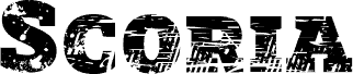
Scoria was born as a typographic relic rescued from a devastated landscape of a torn world.
Its presence is aggressive, heavy, and profoundly expressive, like a fragment of industrial architecture surviving a catastrophe. It screams from the depths of its broken and eroded texture. Each letter seems to carry scars, cracks, and memory, in a declaration of typographic rebellion that adapts to the most intense and urban contexts, a symbol of resistance amidst chaos.
One of Scoria's most distinctive features is its layered font system. I designed the Regular and Bold versions as inseparable companions to work together in overlapping, allowing for the creation of purely typographic headlines in two or more colors with enormous visual impact.