1550
OpenType個人使用
1550.otf
著者の注記
1550 font is a free distorted display typeface that looks like it’s been cut from thick ink and left to melt at the edges. The chunky, blobby shapes feel hand-drawn and a bit unruly, with uneven curves and soft corners that give every word a warped, analog grit. Letters sit close and heavy, creating dense, inky blocks of text that grab attention from across the room.
Using 1550, this free font shines on horror posters, underground gig flyers, zines, haunted house branding, Halloween packaging, and glitchy album covers. Its irregular rhythm and swollen strokes make headlines feel loud, unstable, and slightly dangerous. For balance, pair 1550 with a clean geometric sans in small supporting text, and keep this distorted display big so its organic wobble and bold silhouette can really do the talking.
--
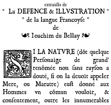
Original creation of the typefaces used in books printed in 1550. Initials by Geofroy Tory (1529).
Using 1550, this free font shines on horror posters, underground gig flyers, zines, haunted house branding, Halloween packaging, and glitchy album covers. Its irregular rhythm and swollen strokes make headlines feel loud, unstable, and slightly dangerous. For balance, pair 1550 with a clean geometric sans in small supporting text, and keep this distorted display big so its organic wobble and bold silhouette can really do the talking.
--
Original creation of the typefaces used in books printed in 1550. Initials by Geofroy Tory (1529).
タグ
文字マップ
このフォントに含まれる異なる文字マップを閲覧するには、プルダウンメニューを利用してください。

フォントの基本情報
フォントファミリー
1550
フォントサブファミリー
Regular
ユニークサブファミリーID
Monotype:1550 Regular
フルフォント名
1550
名称表バージョン
Version 1
ポストスクリプトフォント名
1550MT
フォントの拡張情報
サポートされているプラットフォーム
プラットフォーム暗号化中
マイクロソフトユニコード BMPのみ
マッキントッシュラテン語
ユニコードユニコード2.0 とオンワード・セマンティクス、ユニコードBMPのみ
フォントの詳細
作成完了1990-08-06
修正3
グリフカウント172
Emごとのユニット2048
埋め込み権利永続的インストール目的の埋め込み
ファミリークラス無
重さ太字(ボールド)
幅中程度(正常)
幅のタイプ通常
Mac仕様ボールド体
方向強い左右方向のグリフのみ
パターンの性質定期的に
傾き通常
ストロークの重さ中
ピッチモノスペースでない