2 Prong Tree
TrueTypeフリーウェア
2PROT___.TTF
タグ
著者の注記
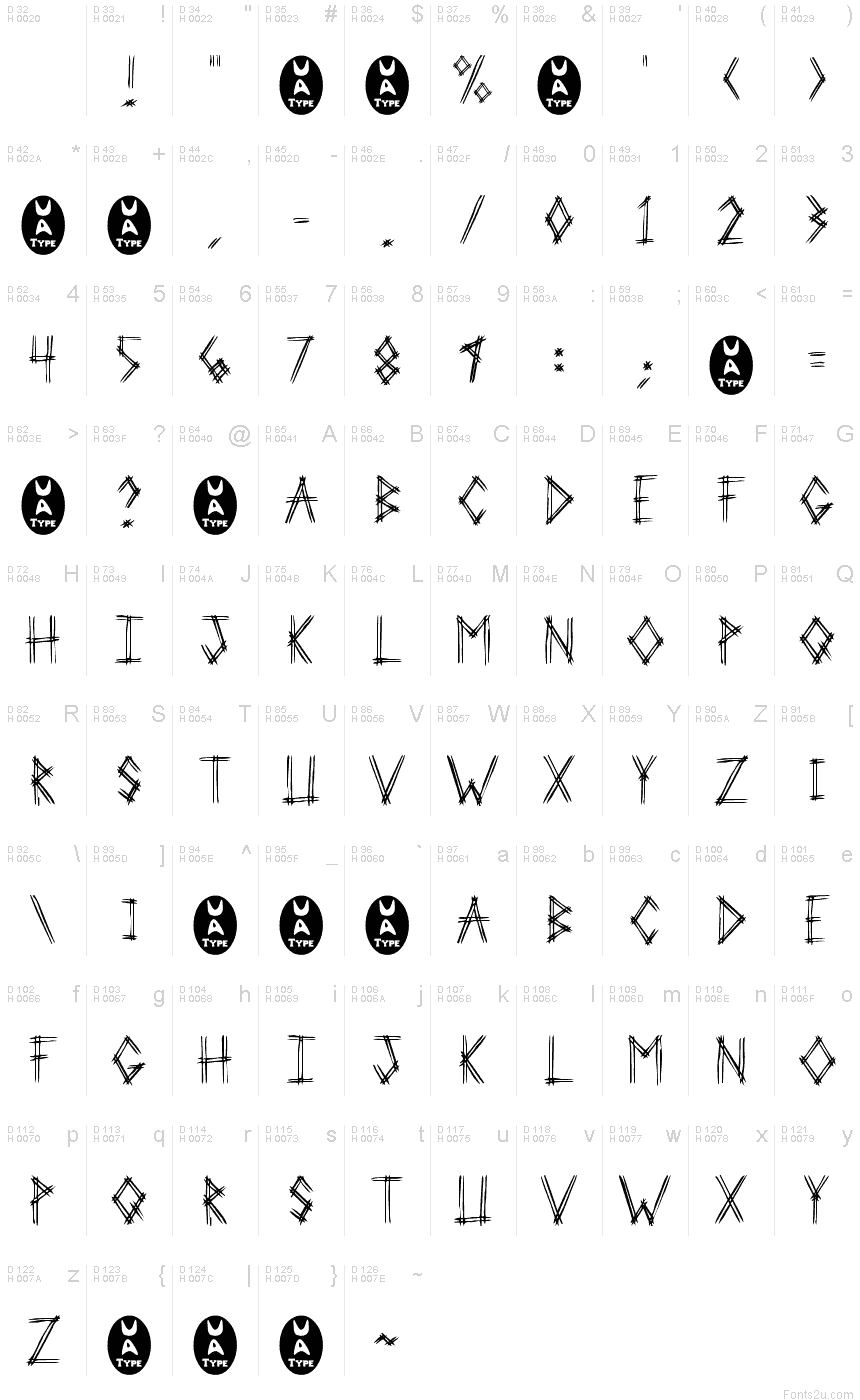
2 Prong Tree is a captivating script font designed by Ben McGehee. With its bold, angular strokes and distinctive "tree-like" shapes, this typeface exudes an undeniable sense of edginess and unconventionality. The "trash" style lends it a raw, gritty aesthetic that would be well-suited for album covers, concert posters, and other high-impact design projects.
The font's striking visual identity makes it a versatile choice for a wide range of applications. Its dynamic, almost kinetic appearance could breathe new life into branding initiatives, while the font's bold, assertive personality would complement experimental typography and digital art. Whether employed for headlines, logotypes, or decorative accents, "2 Prong Tree" promises to leave a lasting impression on viewers.
The font's striking visual identity makes it a versatile choice for a wide range of applications. Its dynamic, almost kinetic appearance could breathe new life into branding initiatives, while the font's bold, assertive personality would complement experimental typography and digital art. Whether employed for headlines, logotypes, or decorative accents, "2 Prong Tree" promises to leave a lasting impression on viewers.
文字マップ
このフォントに含まれる異なる文字マップを閲覧するには、プルダウンメニューを利用してください。

フォントの基本情報
著作権告示
Another Freeware font from UnAuthorized Type
フォントファミリー
2 Prong Tree
フォントサブファミリー
Regular
ユニークサブファミリーID
Macromedia Fontographer 4.1 2 Prong Tree
フルフォント名
2 Prong Tree
名称表バージョン
1.0 (5/24/97)
ポストスクリプトフォント名
2ProngTree
登録商標告示
UnAuthorized Type
製造元
デザイナー
説明
This version includes only capital letters, and some commonly used punctuation. plus the new UA Type dingbat (just to amuse myself).
When I was sitting in Huddle House one night, drinking coffee, I was showing my girlfriend the fonts I was working on. I drew out 3-Prong Tree, and she said that she didn't like it. She told me to do it with just 2 lines on every letter. So I tried that with this one.
She realized after the finished product of 3-Prong Tree that it was good, but I went on and did 2-Prong Tree just to see the difference. 3-Prong looks better at smaller point sizes (because it's fatter), but 2-Prong Tree looks better at larger point sizes (because the letters are cleaner).
フォントの拡張情報
サポートされているプラットフォーム
プラットフォーム暗号化中
マイクロソフトユニコード BMPのみ
マッキントッシュラテン語
ユニコードユニコード1.0セマンティクス
フォントの詳細
作成完了1997-05-24
修正1
グリフカウント110
Emごとのユニット1000
埋め込み権利埋め込み制限(禁止!)
ファミリークラススクリプト
重さやや軽(セミライト)
幅ややコンデンス(横幅狭)化
幅のタイプ通常
Mac仕様ボールド体
方向強い左右方向のグリフ、中立も含む
パターンの性質定期的に
傾き通常
ストロークの重さ中
ピッチモノスペースでない
記号セットWindows 3.1 ANSI