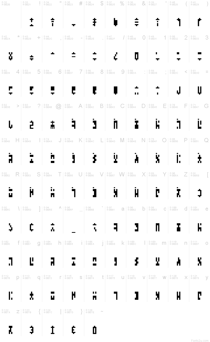
Ancient G Modern
TrueType個人使用
- ユーロ
Ancient_G_Modern.ttf
タグ
著者の注記
Ancient G Modern is my extension of SGA/SG1 ANCIENT canon glyphset to create a fuller font which distinguishes case, has punctuation and extended chars. The purpose: so that fans can use ANCIENT lettersets more practically, by applying this font to existing docs, typing in it, or even using it as Windows display font for menus etc.
Questions or comments can be directed to me at genaris at gmail dot com.
Questions or comments can be directed to me at genaris at gmail dot com.
文字マップ
このフォントに含まれる異なる文字マップを閲覧するには、プルダウンメニューを利用してください。

フォントの基本情報
著作権告示
by Gen Aris -Inspired by fan fonts Anquietas, Alteran, & my personal prefs . . .
フォントファミリー
Ancient G Modern
フォントサブファミリー
Regular
ユニークサブファミリーID
Ancient G Modern:Version 1.00
フルフォント名
Ancient G Modern
名称表バージョン
Version 1.00 September 26, 2008, initial release
ポストスクリプトフォント名
AncientGModern
登録商標告示
FANS are welcome to USE or MODIFY at will but please RENAME any modified versions you may create as to avoid confusion. :)
製造元
Gen Aris
デザイナー
Gen Aris
説明
A variant of the ANCIENT glyphsets used by the Ancients in Stargate: Atlantis.
The purpose with this revision is to CREATE PUNCTUATION and ADDITIONAL CHARS/SYMBS to facilitate better clarity when applying this font to English documents which contain punctuation and other characters.
Per show canon, the Ancients did not appear to use punctuation marks, nor did they distinguish between Upper/Lower case. Again, to facilitate use of this font in regular documents or even as the Windows font (for menus etc) I have created CAPITALIZED VARIANTS which are identical to the lower case except I added a SQUARE DOT FLOATING ABOVE TOP LEFT of CAPPED KEYS. Passwords and user names sometimes use L/case and U/case letters, so it is necessary to distinguish the 2 cses in daily life here on Earth!
My logic for the design of new characters is as follows:
Letters are made up of white/black blocked spaces dividing on a 3 wide by 4 high grid. A few letters make use of subdivsions within the grid.
In canon, all numerals share a centered descender "tail" unlike the letters.
I took this further, by giving all punctuation mark glyphs a centered ascender on top, like an upside down version of the numeral tail -- an "antenna" if you will. This should make it easier to become facile at visually distinguishing punctuation marks from letters or numbers.
Some punctuation marks or symbols are used in numeric/math contexts partly or wholly. So, math or number oriented and shared alphanumeric/math punctuations are given the "tail" of numerals and the "antenna" of punctuation/symbols to so indicate the context.
The numbers, in canon, have a slightly more subdivided or even an altered grid used in their design than do the letters. Here, as well, both numbers and punctuation/symbols share this more prominent use of subdivision or underlying grid different from the letter glyphs.
Overall, I tried to adhere to the digital, techno-sensibility of the glyphs as seen in SG-1 and SGA while striking a balance with variations of weight and tone so as to be reasonably attractive, while remaining aware of the need to make this practical and functional. How well I fared toward my goals, I leave to you to decide. :)
Gen Aris
genaris@gmail.com
ライセンス
Use and/or modify as desired with no restrictions other than I'd appreciate that revision versions NOT USE the same name to avoid confusion.
優先ファミリー名
Ancient G Modern
優先サブファミリー名
Regular
互換フルネーム
Ancient G Modern
フォントの拡張情報
サポートされているプラットフォーム
プラットフォーム暗号化中
マイクロソフトユニコード BMPのみ
マッキントッシュラテン語
ユニコードユニコード2.0 とオンワード・セマンティクス、ユニコードBMPのみ
フォントの詳細
作成完了2008-09-27
修正1
グリフカウント116
Emごとのユニット1000
埋め込み権利永続的インストール目的の埋め込み
ファミリークラス無
重さやや軽(セミライト)
幅中程度(正常)
Mac仕様ボールド体
方向強い左右方向のグリフ、中立も含む
パターンの性質定期的に
ピッチモノスペースでない