ÉconoSans Reduced 54 Book Exp Ita
TrueType個人使用
EconoSansReduced-54BookExpandedItalic.ttf
タグ
著者の注記
ÉconoSans Reduced 54 Book Exp Italic font is a clean sans serif typeface designed by Ingo Zimmermann of ingoFonts.
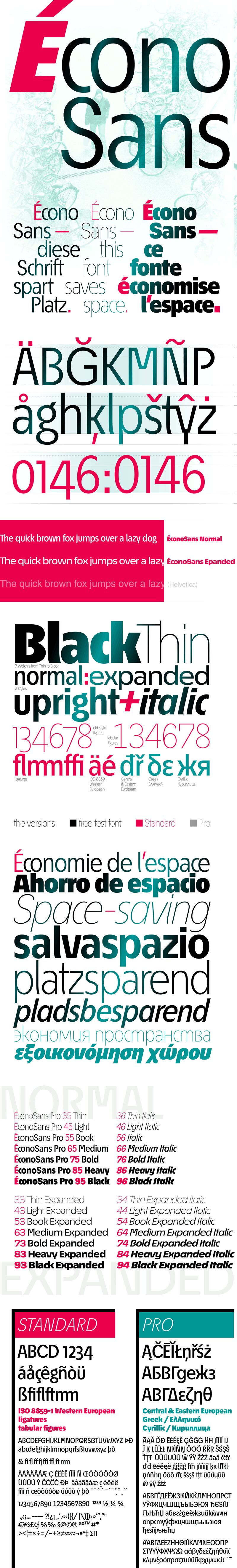
Even the name of the font implies its function: French for the infinitive to save is conomiser. Now if that doesnt sound good
This font saves more space
than any of its kind!
Slim proportions,
but not condensed
Characters which nearly touch
Sparse ascenders and descenders
Distinct forms
How close to each other can the characters of a font get? Theoretically, as close as you want. But obviously, the words should still be legible. And as any designer knows, body clearance of characters also depends on other parameters such as point size and line spacing.
In practice, there are always situations in which as much information as possible has to be positioned in as little space as possible.
The ingoFont conoSans is made for exactly this purpose.
The shapes of the upper and lower case letters are completely matter-of-fact, the way a modern font has got to be. The letters c, e, and s are wide open to their neighbors. An especially distinguished trait of this font is the design of the triangular characters v, w, y, x, k, z and A, V, W, Y, Z, K, X, M, N. And the open form of B, R and P is also not typical in a sans serif.
The distance between letters is kept tight and often the characters nearly touch, but only nearly.
Results of a comparison*: With conoSans you gain approximately 20% more text in a line than with Tahoma, and even still more than 10% compared to Helvetica Neue, not to mention the old normal Helvetica
* In order to truly compare, the fonts were measured up to the same visual size, i.e. conoSans 12 pts, Avenir Next 12.5 pts, Bell Centennial 12.5 pts, Helvetica 11 pts, Tahoma 11 pts.
In addition to the normal figures, conoSans also includes tabular figures with unvarying width as well as ligatures (character connections). Among the ligatures, the double mm is especially unusual and is hardly familiar, but can contribute greatly to saving space without catching the readers eye.
Tabular figures and ligatures can be turned on and off by means of the corresponding Open Type functions of the user program.
The font downloadable here is a reduced version (without punctuation, ligatures, numbers etc.). A commercial version of this font (with all features) is available at www.ingofonts.com.
文字マップ
このフォントに含まれる異なる文字マップを閲覧するには、プルダウンメニューを利用してください。

フォントの基本情報
著作権告示
Copyright (c) 2016 by Ingo Zimmermann. Alle Rechte vorbehalten.
フォントファミリー
EconoSans Red Exp
フォントサブファミリー
Italic
ユニークサブファミリーID
Version 3.013;ifon;EconoSansRed-54BookExpIta;2016;FL714
名称表バージョン
Version 3.013
ポストスクリプトフォント名
EconoSansRed-54BookExpIta
製造元
デザイナー
説明
Copyright 2016 by ingoFonts Ingo Zimmermann, Augsburg. All rights reserved.
フォントの拡張情報
サポートされているプラットフォーム
プラットフォーム暗号化中
ユニコードユニコード2.0 とオンワード・セマンティクス、ユニコードBMPのみ
マッキントッシュラテン語
マイクロソフトユニコード BMPのみ
フォントの詳細
作成完了2016-07-13
修正3
グリフカウント53
Emごとのユニット1000
埋め込み権利永続的インストール目的の埋め込み
ファミリークラスサンセリフ
重さやや軽(セミライト)
幅拡張
方向強い左右方向のグリフ、中立も含む
パターンの性質イタリック
ピッチモノスペースでない
完全版は、以下のリストに示された28フォントの重さを含んでいます。
EconoSansReduced-54BookExpandedItalic.ttf
EconoSansReduced-43LightExpanded.ttf
EconoSansReduced-76BoldItalic.ttf
EconoSansReduced-93BlackExpanded.ttf
EconoSansReduced-45Light.ttf
EconoSansReduced-35Thin.ttf
EconoSansReduced-63MediumExpanded.ttf
EconoSansReduced-64MediumExpandedItalic.ttf
EconoSansReduced-66MediumItalic.ttf
EconoSansReduced-75Bold.ttf
EconoSansReduced-53BookExpanded.ttf
EconoSansReduced-84HeavyExpandedItalic.ttf
EconoSansReduced-36ThinItalic.ttf
EconoSansReduced-56Italic.ttf
EconoSansReduced-55Book.ttf
EconoSansReduced-94BlackExpandedItalic.ttf
EconoSansReduced-73BoldExpanded.ttf
EconoSansReduced-34ThinExpandedItalic.ttf
EconoSansReduced-95Black.ttf
EconoSansReduced-96BlackItalic.ttf
EconoSansReduced-83HeavyExpanded.ttf
EconoSansReduced-46LightItalic.ttf
EconoSansReduced-65Medium.ttf
EconoSansReduced-86HeavyItalic.ttf
EconoSansReduced-33ThinExpanded.ttf
EconoSansReduced-85Heavy.ttf
EconoSansReduced-44LightExpandedItalic.ttf
EconoSansReduced-74BoldExpandedItalic.ttf
ÉconoSans Reduced 43 Light Expanded
TrueType個人使用
ÉconoSans Reduced 76 Bold Italic
TrueType個人使用
ÉconoSans Reduced 93 Black Expanded
TrueType個人使用
ÉconoSans Reduced 45 Light
TrueType個人使用
ÉconoSans Reduced 35 Thin
TrueType個人使用
ÉconoSans Reduced 63 Med Exp
TrueType個人使用
ÉconoSans Reduced 64 Med Exp Ita
TrueType個人使用
ÉconoSans Reduced 66 Medium Italic
TrueType個人使用
ÉconoSans Reduced 75 Bold
TrueType個人使用
ÉconoSans Reduced 53 Book Expanded
TrueType個人使用
ÉconoSans Reduced 84 Heavy Exp Ita
TrueType個人使用
ÉconoSans Reduced 36 Thin Italic
TrueType個人使用
ÉconoSans Reduced 56 Italic
TrueType個人使用
ÉconoSans Reduced 55 Book
TrueType個人使用
ÉconoSans Reduced 94 Black Exp Ita
TrueType個人使用
ÉconoSans Reduced 73 Bold Expanded
TrueType個人使用
ÉconoSans Reduced 34 Thin Exp Ita
TrueType個人使用
ÉconoSans Reduced 95 Black
TrueType個人使用
ÉconoSans Reduced 96 Black Italic
TrueType個人使用
ÉconoSans Reduced 83 Heavy Expanded
TrueType個人使用
ÉconoSans Reduced 46 Light Italic
TrueType個人使用
ÉconoSans Reduced 65 Medium
TrueType個人使用
ÉconoSans Reduced 86 Heavy Italic
TrueType個人使用
ÉconoSans Reduced 33 Thin Expanded
TrueType個人使用
ÉconoSans Reduced 85 Heavy
TrueType個人使用
ÉconoSans Reduced 44 Light Exp Ita
TrueType個人使用
ÉconoSans Reduced 74 Bold Exp Ita
TrueType個人使用