Em One SemiBold Italic
TrueTypeフリーウェア
- アクセント (部分)
- アクセント (フル)
- ユーロ
EmOne-SemiBoldItalic.ttf
タグ
著者の注記
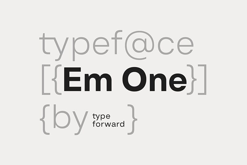
Em One SemiBold Italic font designed by Type Forward Foundry is a clean and minimalistic sans-serif. This modern typeface balances simple aesthetics with a high x-height allowing it to be compact and visually appealing. The font has moderate proportions with minimal contrasts making it both functional and timeless in character. Interested users can have this font for free.
With its versatile style, Em One SemiBold Italic is perfectly handy for websites, apps, magazines, books, journals, brochures, advertisements, environmental graphics, corporate identities, office communications like emails or letters em headings or body text alike.
--
Get the full font:
https://www.typeforward.com/typefaces/em-one
Design Approach:
Em One is the first typeface developed in collaboration with our colleague Luboslav Boyanov, a graduate of the National Academy of Art Sofia. Our aim was to create a functional typeface with a broad range of applications, including web and print, branding, editorial design, and various other contexts. This typeface embodies the distinctive character and aesthetics of classic Swiss design while maintaining a straightforward appearance.
Distinct Features:
Key features of Em One include a tall x-height, minimal contrast between strokes, and moderate proportions that enhance readability. Refined letter spacing contributes to its overall appeal, while unique elements in certain letters add character without introducing excessive visual noise. This makes Em One versatile and well-balanced between functionality and graphic identity.
Font Family Composition:
Em One consists of 9 weights ranging from Thin to Black, each with a corresponding italic version. It is available in refined OTF, TTF, and web font formats. Additionally, a variable font format offers greater flexibility for dynamic design solutions.
Technical Specifications:
Designed for a diverse audience, Em One supports over 220 languages including Extended Latin and Cyrillic characters. It incorporates numerous typographic features such as ligatures, stylistic sets, contextual alternatives, and OpenType functionalities.
Usage:
Em One is multifunctional and adaptable; the various weights can serve as standalone elements or be integrated into cohesive design systems. Thicker and thinner weights are ideal for headlines and display use while middleweights are optimized for text blocks. Specifically optimized for screens, Em One performs well across media formats by balancing glyphs with negative space for effective print use.
Summary:
Em One is a practical sans-serif typeface influenced by popular Swiss designs from the mid-20th century. Built as a multipurpose font, it excels in both display graphics and functional contexts while remaining recognizable and characterful.
文字マップ
このフォントに含まれる異なる文字マップを閲覧するには、プルダウンメニューを利用してください。

フォントの基本情報
フォントファミリー
Em One SemiBold
フォントサブファミリー
Italic
ユニークサブファミリーID
1.000;SPT;EmOne-SemiBoldItalic
フルフォント名
Em One SemiBold Italic
名称表バージョン
Version 1.000
ポストスクリプトフォント名
EmOne-SemiBoldItalic
製造元
デザイナー
説明
Geometric Typeface
フォントの拡張情報
サポートされているプラットフォーム
プラットフォーム暗号化中
ユニコードユニコード2.0 とオンワード・セマンティクス、ユニコードBMPのみ
マイクロソフトユニコード BMPのみ
フォントの詳細
作成完了2024-08-23
修正1
グリフカウント609
Emごとのユニット1000
埋め込み権利プレビューと印刷目的の埋め込みの可
ファミリークラスサンセリフ
重さやや太字(セミボールド)
幅中程度(正常)
Mac仕様下線
方向強い左右方向のグリフ、中立も含む
パターンの性質イタリック
ピッチモノスペースでない
完全版は、以下のリストに示された2フォントの重さを含んでいます。
EmOne-SemiBoldItalic.ttf
EmOne-SemiBold.ttf
EmOne-SemiBold.ttf
Em One SemiBold
TrueTypeフリーウェア
