FaberSansPro-Schwer
TrueType個人使用
FaberSansPro85reduced.ttf
タグ
著者の注記
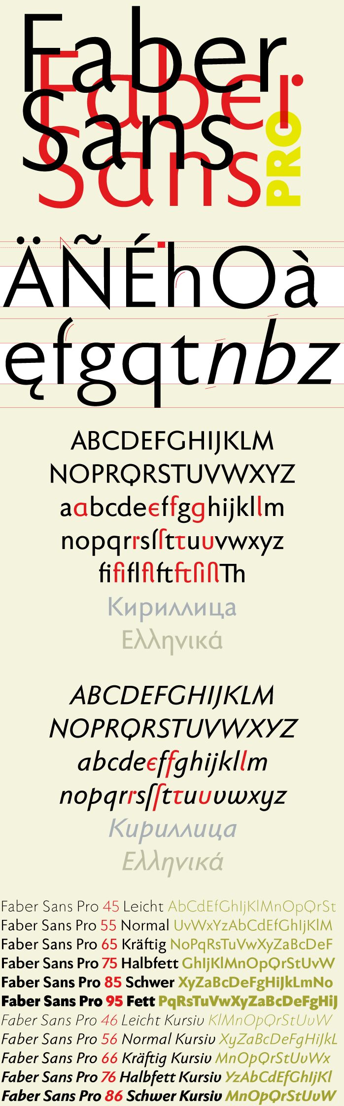
Two fonts in one: a classic-modern sans serif appearing in two forms "standard" and a "stylistic alternate" with uncial script-orientated characters which give the font a completely different "look."
The idea for one of the very first ingoFonts, the sans serif "Faber Eins & Zwei," originated in 1996. This typeface gained popularity over the years, especially in Anglo-Saxon countries. A lot has changed since then not just in font technology. In 2010 it was time for a basic revision of this attractive font, and time to bring it up to date with current font technology.
A uniqueness of Faber Sans Pro is that it is actually composed of two fonts. The "basic typeface" is a sans serif in the classic-modern style of type creations of the early 20th century godfathered by Futura from Paul Renner and Gill Sans from Eric Gill. The Roman Capitalis provided the model for the classically proportioned capital letters and the harmonic shapes of the humanistic minuscule for the lower case characters. And so a font with pleasant rhythmic proportions was created and is extremely comfortable to read, especially in large amounts of text; but, it is also reader-friendly under adverse typographic conditions on the monitor.
A "second" typeface with its own personal character resulted as stylistic alternates were designed for the letters a e f g l t u in accordance with the uncial scripts of the late antiquity or rather the early Middle Ages. And the r is given a playful point in the stylistic alternates. Modern OpenType technology makes it possible to combine the previously separate typefaces into one font. The stylistic alternate can be accessed via the OpenType-Functions Discretionary Ligatures or also Stylistic Alternates (and of course the glyph panel).
Unlike classic sans serifs, Faber Sans Pro includes a "true" italic. The italic characters are not simply just slanted variations of the upright, but the characters originated out of handwriting styles; they are rounder and the stroke flow is more fluent than on the upright letters. Some italic letters truly have their very own design which clearly comes from handwriting, particularly noticeable on a and g.
At ingoFonts all fonts can be downloaded. Gratis. Free.
Here's the catch: The files offered here to download contain only a reduced font. That means, the font only consists of uppercase and lowercase from A to Z or rather, a to z.
The complete font including numerals, umlauts, punctuation and especially ligatures is only available with your order and your cash.
文字マップ
このフォントに含まれる異なる文字マップを閲覧するには、プルダウンメニューを利用してください。

フォントの基本情報
著作権告示
Copyright (c) 2010 by Ingo Zimmermann ingoFont Augsburg. All rights reserved.
フォントファミリー
Faber Sans Pro reduced
フォントサブファミリー
85 Schwer
ユニークサブファミリーID
IngoZimmermanningoFontAugsburg: Faber Sans Pro 85 Schwer: 2010
フルフォント名
FaberSansPro-Schwer
名称表バージョン
Version 4.012
ポストスクリプトフォント名
FaberSansPro-Schwer
登録商標告示
Faber Sans Pro 85 Schwer is a trademark of Ingo Zimmermann ingoFont Augsburg.
製造元
デザイナー
説明
Copyright (c) 2010 by Ingo Zimmermann ingoFont Augsburg. Reviewed. All rights reserved.
フォントの拡張情報
サポートされているプラットフォーム
プラットフォーム暗号化中
ユニコードユニコード2.0 とオンワード・セマンティクス、ユニコードBMPのみ
マッキントッシュラテン語
マイクロソフトユニコード BMPのみ
フォントの詳細
作成完了2010-10-24
修正4
グリフカウント53
Emごとのユニット1000
埋め込み権利永続的インストール目的の埋め込み
ファミリークラスサンセリフ
重さ太字(ボールド)
幅中程度(正常)
Mac仕様イタリック体
方向強い左右方向のグリフ、中立も含む
パターンの性質定期的に
ピッチモノスペースでない
完全版は、以下のリストに示された10フォントの重さを含んでいます。
FaberSansPro85reduced.ttf
FaberSansPro95reduced.ttf
FaberSansPro65reduced.ttf
FaberSansPro76reduced.ttf
FaberSansPro66reduced.ttf
FaberSansPro55reduced.ttf
FaberSansPro45reduced.ttf
FaberSansPro86reduced.ttf
FaberSansPro56reduced.ttf
FaberSansPro75reduced.ttf
FaberSansPro95reduced.ttf
FaberSansPro65reduced.ttf
FaberSansPro76reduced.ttf
FaberSansPro66reduced.ttf
FaberSansPro55reduced.ttf
FaberSansPro45reduced.ttf
FaberSansPro86reduced.ttf
FaberSansPro56reduced.ttf
FaberSansPro75reduced.ttf
FaberSansPro-Fett
TrueType個人使用
FaberSansPro-Kraeftig
TrueType個人使用
FaberSansPro-HalbfettKursiv
TrueType個人使用
FaberSansPro-KraeftigKursiv
TrueType個人使用
FaberSansPro-Normal
TrueType個人使用
FaberSansPro-Leicht
TrueType個人使用
FaberSansPro-SchwerKursiv
TrueType個人使用
FaberSansPro-NormalKursiv
TrueType個人使用
FaberSansPro-Halbfett
TrueType個人使用