Gronau Neue Trial Regular
TrueType個人使用
- アクセント (部分)
- アクセント (フル)
- ユーロ
Gronau-Neue-Regular-trial.ttf
タグ
著者の注記
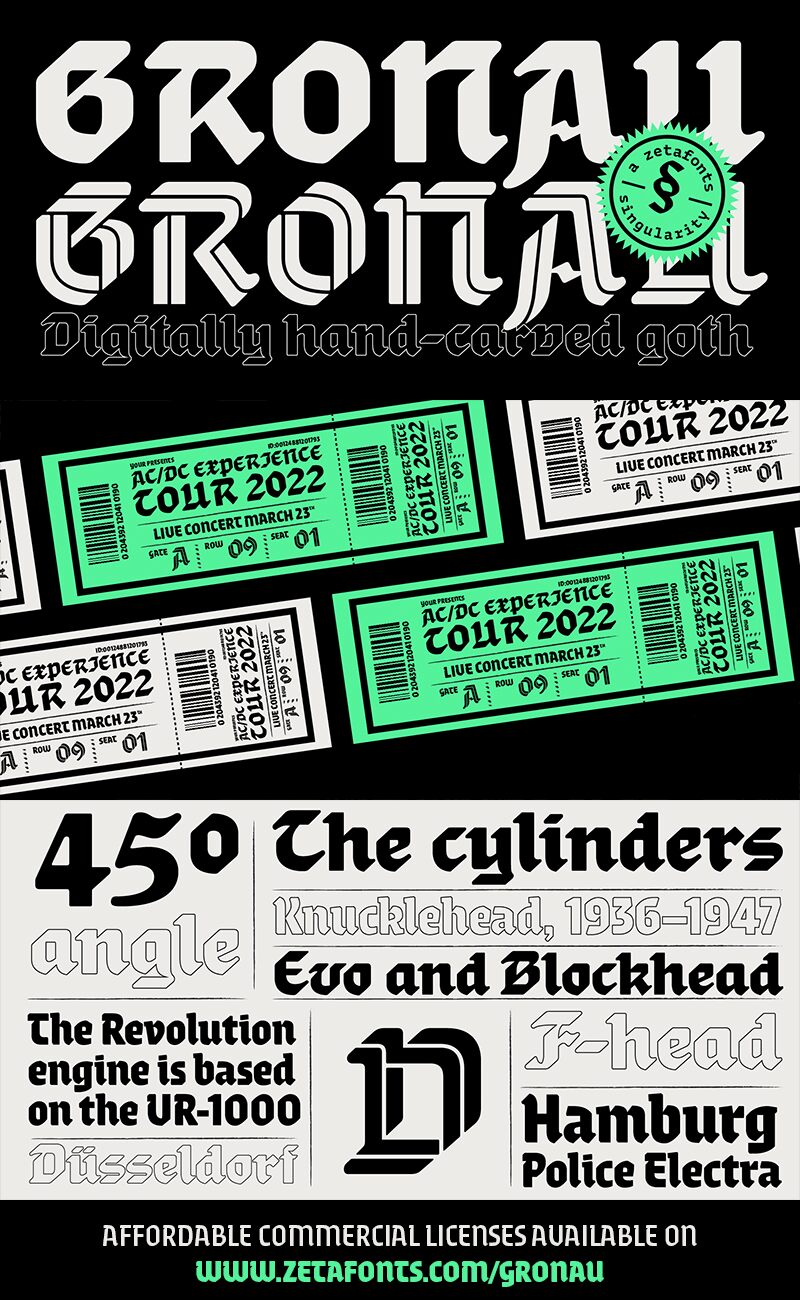
Gronau Neue font is a modern gothic typeface designed by Andrea Tartarelli of Zetafonts.
The font here is for PERSONAL/NON-COMMERCIAL USE ONLY!
To download the full font family (all weights, glyphs and numbers) and acquire the commercial license please visit our website:
https://www.zetafonts.com/gronau
Join the exclusive Type Club to get free fonts and special offers on new releases!
https://www.zetafonts.com/typeclub
CONTACT US:
website: https://www.zetafonts.com
have a question?: info@zetafonts.com
---
Andrea Tartarelli discovered the letterforms that would inspire his Gronau family in a 1912 specimen by the Berlin-based Wilhelm Gronaus Schriftgieerei, that showcased the typeface Fette Reichs-Deutsch, designed by Wilhelm Gronau in 1902. Even if Gronau also cerated Art Nouveau inspired typefaces like Berolina or idiosyncratic Stterlin blackletter cursives like Hohenzollern Schrift, his work mostly centres on gothic letter shapes.
Fette Reichs Deutsch, that Tartarelli digitised as Gronau Fette, sports a very broad and square structure, mild contrast and a very geometric treatment of shapes, with slightly rounded terminals, straight lines and clear 45 degree angles. This unusual, pre-modernist approach to letterform inspired Tartarelli to explore its potential for display use, with the creation of an inline version that modernises the original and pushes to the maximum its dynamic energy. Gronau inline design transforms the broad nib marks into a ribbon folding in 3d to recreate the original letterforms, adding a dynamic, sporty language to the original typeface gothic feel. With Gronau Neue, Tartarelli tried to find a contemporary, gestural interpretation of blackletter shapes, adding a slightly calligraphic look and feel to to the original hasty lines and energetic construction.
This third variant of Gronau is the one that most departs from the original mode: using generous x-height and condensed proportions, it achieves a more contemporary feel and extends the family expressive range into display, editorial and packaging options. All the versions of Gronau sport a wide range of Open type features and glyph alternates, further enriching the usage possibility of this typeface that embodies our contemporary swap culture by embracing the many subtleties and historical interpretations of blackletter typography while at the same time playfully expressing with a digital, dynamic spirit.
文字マップ
このフォントに含まれる異なる文字マップを閲覧するには、プルダウンメニューを利用してください。

フォントの基本情報
著作権告示
Copyright 2022 Gronau by Andrea Tartarelli. All rights reserved.
フォントファミリー
Gronau Neue Trial
フォントサブファミリー
Regular
ユニークサブファミリーID
1.000;ZTFN;GronauNeueTrial-Regular
フルフォント名
Gronau Neue Trial Regular
名称表バージョン
Version 1.000
ポストスクリプトフォント名
GronauNeueTrial-Regular
製造元
デザイナー
フォントの拡張情報
サポートされているプラットフォーム
プラットフォーム暗号化中
ユニコードユニコード2.0 とオンワード・セマンティクス、ユニコードBMPのみ
マイクロソフトユニコード BMPのみ
フォントの詳細
作成完了2022-07-06
修正1
グリフカウント391
Emごとのユニット1000
埋め込み権利永続的インストール目的の埋め込み
ファミリークラス無
重さやや軽(セミライト)
幅コンデンス(横幅狭)化
Mac仕様ボールド体
方向強い左右方向のグリフ、中立も含む
パターンの性質定期的に
ピッチモノスペースでない
完全版は、以下のリストに示された4フォントの重さを含んでいます。
Gronau-Neue-Regular-trial.ttf
Gronau-Neue-Bold-trial.ttf
Gronau-Fette-trial.ttf
Gronau-Inline-trial.ttf
Gronau-Neue-Bold-trial.ttf
Gronau-Fette-trial.ttf
Gronau-Inline-trial.ttf
Gronau Trial Neue
TrueType個人使用
Gronau Trial Fette
TrueType個人使用
Gronau Trial Inline
TrueType個人使用