Josefov-Light
OpenType個人使用
Josefov_Light.otf
タグ
著者の注記
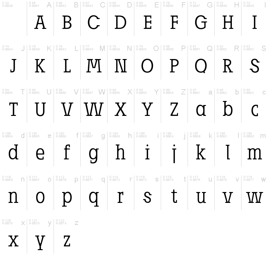
Josefov-Light is as the name implies directly derived from the sans serif text font Josef designed by Ingo Zimmermann of ingoFont.
Here also originates the touch of the unusual relation of large x-height to the very short ascenders, even for modern serif fonts. The basic thought was to create a font with heavy rounded serifs in the style of Clarendon but which hardly reminds one of that particular font. In addition, the form principle of rounded serifs is applied whenever possible for example at the points where the individual strokes of the characters join one another.
JOSEFOV seems very technical, very constructed (and truly is). In order to soften up the rigid impression, the serifs are applied at some points contrary to the tradition handed down, as with the upper case A C G K M V W and the lower case a b d h i j k l s t. Historically there is no example of the laterally oriented serifs of capital and small s (S) and C G. On the other hand, the double-sided serifs on the stems of b d h k l appear at the beginning of modern times in the very first serif types from Sweynheim and Pannartz and others. The double-sided serifs of A M V W were also customary in the first decades of printing.
The font downloadable here is a reduced version (without punctuation, ligatures, numbers etc.). A commercial version of this font (with all features) is available at www.ingofonts.com.
文字マップ
このフォントに含まれる異なる文字マップを閲覧するには、プルダウンメニューを利用してください。

フォントの基本情報
著作権告示
Copyright (c) 2006 by Josefov is a ingoFont, o Zimmermann, Augsburg, www.ingo-zimmermann.de. All rights reserved.
フォントファミリー
Josefov
フォントサブファミリー
Light
ユニークサブファミリーID
JosefovisaingoFont,Zimmermann,Augsburg,www.ingo-zimmermann.de: Josefov Light: 2006
フルフォント名
Josefov-Light
名称表バージョン
Version 1.001 2006
ポストスクリプトフォント名
Josefov-Lightreduced
登録商標告示
JosefovIF Light is a trademark of Josefov is a ingoFont, o Zimmermann, Augsburg, www.ingo-zimmermann.de.
製造元
デザイナー
説明
Copyright (c) 2006 by Josefov is a ingoFont, o Zimmermann, Augsburg, www.ingo-zimmermann.de. All rights reserved.
フォントの拡張情報
サポートされているプラットフォーム
プラットフォーム暗号化中
ユニコードユニコード2.0 とオンワード・セマンティクス、ユニコードBMPのみ
マッキントッシュラテン語
マイクロソフトユニコード BMPのみ
フォントの詳細
作成完了2009-03-15
修正1
グリフカウント53
Emごとのユニット1000
埋め込み権利永続的インストール目的の埋め込み
ファミリークラス無
重さやや軽(セミライト)
幅ややコンデンス(横幅狭)化
Mac仕様ボールド体
方向強い左右方向のグリフ、中立も含む
パターンの性質定期的に
完全版は、以下のリストに示された3フォントの重さを含んでいます。
Josefov_Light.otf
Josefov_Normal.otf
Josefov_Bold.otf
Josefov_Normal.otf
Josefov_Bold.otf
Josefov
OpenType個人使用
Josefov-Bold
OpenType個人使用
