Kaput Black
TrueType個人使用
- アクセント (部分)
- ユーロ
Kaput-Black-FFP.ttf
タグ
著者の注記
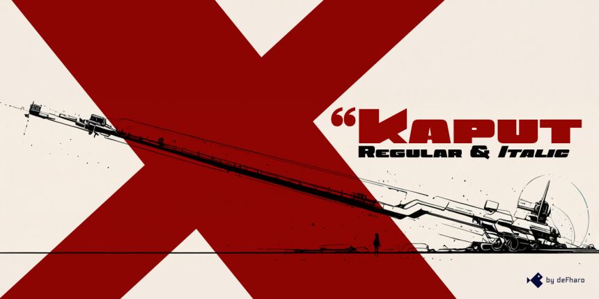
Kaput Black, a unique, heavy uppercase typeface, is here to create great titles and high-impact visual communication.
Kaput Black is designed with a perfect balance between strength and sophistication, it is bold, semi-expanded and spectacularly legible, the thick lines and horns with marked contrasts, which not only catch the eye, but also provide real harmony, thanks to the meticulous work of metrics and kerning.
Available in Regular and Italic versions with a 20-degree tilt that adds dynamism, modernity and technology.
=========================
DOWNLOAD FULL VERSIONS & LICENSES: https://defharo.com/fonts/kaput/
=========================
文字マップ
このフォントに含まれる異なる文字マップを閲覧するには、プルダウンメニューを利用してください。

フォントの基本情報
著作権告示
Copyright (c) 2024 by deFharo. All rights reserved.
フォントファミリー
Kaput Black Black
フォントサブファミリー
Regular
ユニークサブファミリーID
Version 2.244;DFHA;KaputBlack;2024;FL842
フルフォント名
Kaput Black
名称表バージョン
Version 2.244
ポストスクリプトフォント名
KaputBlack
登録商標告示
Kaput Black is a trademark of deFharo.
製造元
デザイナー
説明
Kaput Black, a heavy and unique uppercase typeface family, is here to revolutionize the way we conceive great titles and high-impact visual communication.
Kaput is designed with a perfect balance between strength and sophistication, it is bold, semi-expanded and spectacularly legible, the thick lines and horns with marked contrasts, not only capture attention, but also provide meticulous harmony, thanks also to a thorough work on metrics and kerning.
Available in Black and Black Italic versions, the 20-degree inclination of the italic version adds a touch of dynamism and modernity.
フォントの拡張情報
サポートされているプラットフォーム
プラットフォーム暗号化中
ユニコードユニコード2.0 とオンワード・セマンティクス、ユニコードBMPのみ
マッキントッシュラテン語
マイクロソフトユニコード BMPのみ
フォントの詳細
作成完了2024-11-24
修正2
グリフカウント243
Emごとのユニット1000
埋め込み権利埋め込み制限(禁止!)
ファミリークラスサンセリフ
重さ過度に太字(ウルトラボールド)
幅極拡張
Mac仕様ボールド体
方向強い左右方向のグリフ、中立も含む
パターンの性質定期的に
ピッチモノスペースでない