Lourde Regular
TrueTypeフリーウェア
- アクセント (部分)
- アクセント (フル)
- ユーロ
lourde.ttf
タグ
著者の注記
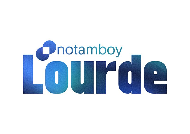
Lourde font by Notamboy captivates the eye with its modern aesthetic, strong presence, and versatile use in all projects. This bold condensed sans serif concept is built on a geometric structure which contributes to the overall impactful visual. Every single letter in this free font has an equal place in the final text regardless of its position.
The undertakings Lourde was built for includes (but are not limited to): advertisements, headlines, titles, branding ideas, logos, and packaging. Websites can also enjoy a touch of modernism with it as well as invitations such as those for business or for personal occasions and parties.
--
The undertakings Lourde was built for includes (but are not limited to): advertisements, headlines, titles, branding ideas, logos, and packaging. Websites can also enjoy a touch of modernism with it as well as invitations such as those for business or for personal occasions and parties.
--
文字マップ
このフォントに含まれる異なる文字マップを閲覧するには、プルダウンメニューを利用してください。

フォントの基本情報
著作権告示
Copyright notamboy 2023
フォントファミリー
Lourde
フォントサブファミリー
Regular
ユニークサブファミリーID
Lourde
フルフォント名
Lourde Regular
名称表バージョン
Version 1.0
ポストスクリプトフォント名
Lourde
登録商標告示
FontStruct is a trademark of FontStruct.com
製造元
デザイナー
説明
“Lourde” was built with FontStruct
Designer description: This is my first ever font using ideas to make an heavy sans-serif typeface. I was inspired by elmoyenique and Jamie Place (FontBlast). I'm not stealing ideas from anybody by the way, I've wanted to share something to explain a journey of making my own fonts in life.
I got some aspect of making the glyphs look heavier. I've tried to make the letter f, but it flawlessly has the same height as the other glyphs. If I make number four, than I've obviously make it like this because the slanted bricks are not enough to make up a four glyph. Some of the glyphs (for example: ð, ß, ™, ®) are hard to build it because it was considered to be rounded by its curve and too small if the text was heavier.
When I run out of name ideas, the only idea of this font name i've chose is Lourde (french word for heavy).
フォントの拡張情報
サポートされているプラットフォーム
プラットフォーム暗号化中
ユニコードユニコード2.0 とオンワード・セマンティクス、ユニコードBMPのみ
ユニコード2.0 とオンワード・ セマンティクス、 全ユニコードレパートリー
マイクロソフトユニコード BMPのみ
フォントの詳細
作成完了2023-08-06
修正1
グリフカウント634
Emごとのユニット1024
埋め込み権利プレビューと印刷目的の埋め込みの可
ファミリークラスサンセリフ
重さ太字(ボールド)
幅コンデンス(横幅狭)化
Mac仕様ボールド体
方向強い左右方向のグリフ、中立も含む
パターンの性質定期的に