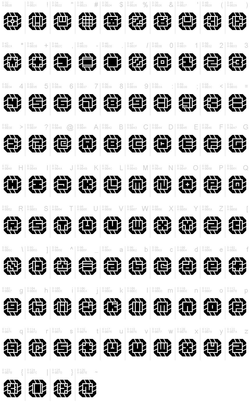
Might Chain Regular
TrueTypeフリーウェア
might-chain.ttf
タグ
著者の注記
Some kind of great big ol' chain!
When glyphs are used in isolation, they somewhat resemble carved signets or seals. Increasing the letter spacingallows you to create a variation of the design. (This is something that must be done in-software since the font will render as monospaced by default.)
When glyphs are used in isolation, they somewhat resemble carved signets or seals. Increasing the letter spacingallows you to create a variation of the design. (This is something that must be done in-software since the font will render as monospaced by default.)
文字マップ
このフォントに含まれる異なる文字マップを閲覧するには、プルダウンメニューを利用してください。

フォントの基本情報
著作権告示
Copyright zephram 2018
フォントファミリー
Might Chain
フォントサブファミリー
Regular
ユニークサブファミリーID
Might Chain
フルフォント名
Might Chain Regular
名称表バージョン
Version 1.0
ポストスクリプトフォント名
Might-Chain
登録商標告示
FontStruct is a trademark of FontStruct.com
製造元
デザイナー
説明
“Might Chain” was built with FontStruct
Designer description: Some kind of great big ol' chain.
In retrospect, I think it looks like a jewelry chain from a dwarven civilization. Perhaps the hypothetical jeweler cut and ground the stones in an imitation of some dwarven font!
When glyphs are used in isolation, they somewhat resemble carved signets or seals. Increasing the letter spacing allows you to create a variation of the design. (This is something that must be done in-software since the font will render as monospaced by default.)
*
12SEP2018: Added lowercase... the low resolution combined with the design method make it very difficult to render distinctive lowercase versions of every letter, but I'll keep working on it. There's a lot of similarity between pairs like S/5, Z/2, etc., so this font is most effectively used in forms of writing wherein context suffices to inform the reader as to the identity of each glyph (lists, prose, and technical writings). If you want to use this in a password system or something, I recommend using one case's glyphs only.
*
Design Rules:
1. Negative spaces will be areas of 0.5 bricks' effective length or width.
2. Negative spaces may exceed the 0.5 measurement only by increments of 0.5 and in only one dimension at a time.
3. Glyphs will fill their framed canvasses to the greatest extent possible while adhering to the other rules.
フォントの拡張情報
サポートされているプラットフォーム
プラットフォーム暗号化中
マイクロソフトユニコード BMPのみ
ユニコードユニコード2.0 とオンワード・セマンティクス、ユニコードBMPのみ
フォントの詳細
作成完了2018-10-18
修正1
グリフカウント102
Emごとのユニット4096
埋め込み権利プレビューと印刷目的の埋め込みの可
ファミリークラス無
重さ極太字(エクストラボールド)
幅中程度(正常)
Mac仕様ボールド体
方向強い左右方向のグリフ、中立も含む
パターンの性質定期的に