Minikin
TrueTypeGNU/GPL
- アクセント (部分)
- アクセント (フル)
Minikin.ttf
タグ
著者の注記
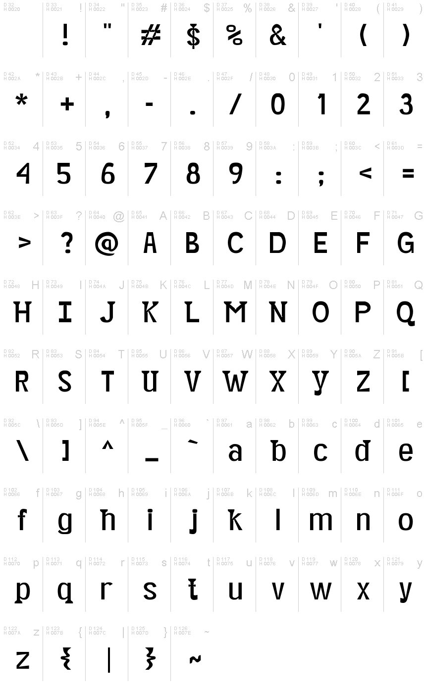
Minikin is a captivating caption font designed for exceptional legibility at diminutive sizes. Crafted by Graham Herrli, this unique typeface boasts a refined, geometric aesthetic that exudes sophistication. Its clean lines and carefully balanced proportions ensure crisp rendering, even in the most space-constrained applications.
The font's precise, minimalist forms lend themselves seamlessly to a wide range of design contexts, from editorial content to branding and signage. Minikin's versatility shines, allowing designers to seamlessly incorporate it into projects that demand a touch of elegance and understated style.
I call it a semi-serif font because it only has serifs on ascenders and descenders. By making the ascenders and descenders so wide, I was able to shrink their height. Its fairly common for descenders to take up about 20% of a fonts height. In Minikin, the descenders only take up 15% of the height. The ascenders are also compressed to take only 15% (measuring between x-height and cap-height). A few characters(,|, {,},l, and) extend beyond the cap-height by a further 3%. This leaves a full 67% of the height for main body of most letters. Some other things that make it legible at small sizes are:
(1) It has low stroke contrast. The thickest strokes are about 13% of the height. The thinnest are about 8%.
(2) It has thick strokes, which prevents it from looking washed-out at small sizes. (At larger sizes, its thick strokes and vertical emphasis make it look a bit like a blackletter.)
(3) Its counters are very open. Rather than anchoring curves with one point, I often anchored them with two, making the circular areas bulge toward becoming rectangles.
(4) Where whitespace points in toward the letter, a little additional whitespace has been hollowed out to prevent that corner from filling with ink when printed. For an example of these hollows, view the ampersand around size 72.
(5) The letters are spaced generously: usually each of the bearings (the margins on each letters edges) is about as wide as a stroke, which means that the space between each letter pair is almost two strokes wide.
You can use this font under a Creative Commons Attribution 2.0 Generic license (https://creativecommons.org/licenses/by/2.0/).
文字マップ
このフォントに含まれる異なる文字マップを閲覧するには、プルダウンメニューを利用してください。

フォントの基本情報
フォントファミリー
Minikin
フォントサブファミリー
Medium
フルフォント名
Minikin
名称表バージョン
Version 001.000
ポストスクリプトフォント名
Minikin
フォントの拡張情報
サポートされているプラットフォーム
プラットフォーム暗号化中
ユニコードユニコード2.0 とオンワード・セマンティクス、ユニコードBMPのみ
マッキントッシュラテン語
マイクロソフトユニコード BMPのみ
フォントの詳細
作成完了2015-07-09
修正1
グリフカウント349
Emごとのユニット1000
埋め込み権利永続的インストール目的の埋め込み
ファミリークラス無
重さやや軽(セミライト)
幅ややコンデンス(横幅狭)化
Mac仕様ボールド体
方向混合方向グリフ
パターンの性質定期的に
ピッチモノスペースでない