Novecento slab wide Normal
OpenTypeフリーウェア
- アクセント (部分)
- アクセント (フル)
- ユーロ
Novecentoslabwide-Normal.otf
タグ
著者の注記
Novecento Slab Wide font by Synthview is a modern serif font that gives aesthetics where every titling feels classic and timeless. Expanding upon the charm of Novecento and its timeless look, this version with expanded letters is an excellent alternative for designers who want something similar but distinctively different at the same time.
Use this lovely font free for branding, websites, quotes, book covers, posters, signage, apparel print design. It will also be stunning in event invitations (especially weddings), advertising design (physical and digital), or even mail stamp designs. Use it anywhere there’s potential to impress!
--
Two of the 32 styles from the Novecento Slab font family are available for free, allowing both commercial and non-commercial use. These are intended for desktop installation only and do not include webfonts.
By downloading these files, you agree to the End User License Agreement (EULA) included in the Zip file.
To obtain webfont, ebook, software embedding, or OEM licenses, please visit myFonts or Fontspring.
The complete Novecento Slab family is also accessible on Adobe Fonts and Monotype Fonts.
For a full set and detailed description of the font features, please visit https://typography.synthview.com/novecento-slab-font-family.php
文字マップ
このフォントに含まれる異なる文字マップを閲覧するには、プルダウンメニューを利用してください。

フォントの基本情報
フォントファミリー
Novecento slab wide Normal
フォントサブファミリー
Regular
ユニークサブファミリーID
1.001;SVTD;Novecentoslabwide-Normal
フルフォント名
Novecento slab wide Normal
名称表バージョン
Version 1.001;PS 001.001;hotconv 1.0.70;makeotf.lib2.5.58329
ポストスクリプトフォント名
Novecentoslabwide-Normal
製造元
デザイナー
説明
OVERVIEW:
Novecento Slab is the “slab serif” companion of Novecento Sans, an uppercase + smallcaps font family inspired on european typographic tendencies between the second half of 19th century and first half of the 20th.
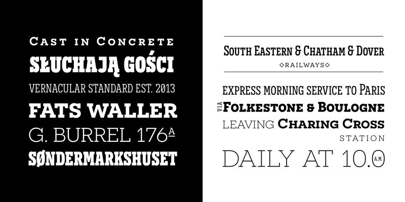
As the excellent French typographer Xavier Dupré said “it seems to have been cast in concrete”. Despite its blocky look, Novecento Slab’s lettershapes are optically corrected and balanced.
This font face is designed to be used mostly for headlines, visual identities or short sentences, both in big and small sizes.
Novecento Slab family was spaced and kerned with love and patience; each font has between 750 and 950 group kerning pairs.
This font is available for licensing in opentype and webfont format, as well as for mobile apps, ebooks and for software embedding.
OPENTYPE FEATURES:
AALT
Accesses All Alternate glyphs from the Glyphs panels in Adobe Illustrator or Indesign.
CASE
Sets All-Caps to activate case sensitive forms: transform lowercase letters, figures and some extra signs to Uppercase; vertically aligns math symbols and punctuation.
DNOM & NUMR
Transforms 0 to 9 figures into numerators (aligned to cap height) and denominators (aligned to baseline).
FRAC
Custom fractions generation feature.
SUPS
Transforms 0 to 9 figures into superiors.
LOCL
Romanian, Moldavian and Polish advanced diacritics support; automatic Catalan punt volant; Dutch localization for accented ij; localization for Turkish i (works also for Kazakh, Tatar, Crimean Tatar, Azeri. Just select your text language to activate the localized accents)
CALT
detects German ß in an uppercase string and substitute it with its uppercase version/
SS01 / SALT
Alternate Q letter shape for ultra narrow line heights.
Implemented both as Stylistic Set n°1 (ss01) and Stylistic Alternate (salt) to maximize compatibility between applications.
SS02 / SALT
Alternate N letter shape. Implemented both as Stylistic Set n°2 (ss02) and Stylistic Alternate (salt) to maximize compatibility between applications.
SS03 / SALT
Alternate I letter shape. Implemented both as Stylistic Set n°3 (ss03) and Stylistic Alternate (salt) to maximize compatibility between applications.
SS04 / SALT
Alternate J letter shape. Implemented both as Stylistic Set n°4 (ss04) and Stylistic Alternate (salt) to maximize compatibility between applications.
SS05 / SALT
Alternate Y letter shape. Implemented both as Stylistic Set n°5 (ss05) and Stylistic Alternate (salt) to maximize compatibility between applications.
LNUM/ONUM
Lining / oldstyle figures; LNUM transforms numbers and monetary symbols in Uppercase; ONUM do the opposite (default figures are ONUM).
TNUM / PNUM
Tabular/ proportional figures. Figures (numbers, monetary and math symbols) of same width always align, in spite of their weight.
ZERO / SALT
Slashed zero alternate glyph. Works with tabular and proportional figures, numerators, denominators and superiors. Implemented both as Zero as Salt to maximize compatibility between applications.
Novecento Slab is the “slab serif” companion of Novecento Sans, an uppercase + smallcaps font family inspired on european typographic tendencies between the second half of 19th century and first half of the 20th.
As the excellent French typographer Xavier Dupré said “it seems to have been cast in concrete”. Despite its blocky look, Novecento Slab’s lettershapes are optically corrected and balanced.
This font face is designed to be used mostly for headlines, visual identities or short sentences, both in big and small sizes.
Novecento Slab family was spaced and kerned with love and patience; each font has between 750 and 950 group kerning pairs.
This font is available for licensing in opentype and webfont format, as well as for mobile apps, ebooks and for software embedding.
OPENTYPE FEATURES:
AALT
Accesses All Alternate glyphs from the Glyphs panels in Adobe Illustrator or Indesign.
CASE
Sets All-Caps to activate case sensitive forms: transform lowercase letters, figures and some extra signs to Uppercase; vertically aligns math symbols and punctuation.
DNOM & NUMR
Transforms 0 to 9 figures into numerators (aligned to cap height) and denominators (aligned to baseline).
FRAC
Custom fractions generation feature.
SUPS
Transforms 0 to 9 figures into superiors.
LOCL
Romanian, Moldavian and Polish advanced diacritics support; automatic Catalan punt volant; Dutch localization for accented ij; localization for Turkish i (works also for Kazakh, Tatar, Crimean Tatar, Azeri. Just select your text language to activate the localized accents)
CALT
detects German ß in an uppercase string and substitute it with its uppercase version/
SS01 / SALT
Alternate Q letter shape for ultra narrow line heights.
Implemented both as Stylistic Set n°1 (ss01) and Stylistic Alternate (salt) to maximize compatibility between applications.
SS02 / SALT
Alternate N letter shape. Implemented both as Stylistic Set n°2 (ss02) and Stylistic Alternate (salt) to maximize compatibility between applications.
SS03 / SALT
Alternate I letter shape. Implemented both as Stylistic Set n°3 (ss03) and Stylistic Alternate (salt) to maximize compatibility between applications.
SS04 / SALT
Alternate J letter shape. Implemented both as Stylistic Set n°4 (ss04) and Stylistic Alternate (salt) to maximize compatibility between applications.
SS05 / SALT
Alternate Y letter shape. Implemented both as Stylistic Set n°5 (ss05) and Stylistic Alternate (salt) to maximize compatibility between applications.
LNUM/ONUM
Lining / oldstyle figures; LNUM transforms numbers and monetary symbols in Uppercase; ONUM do the opposite (default figures are ONUM).
TNUM / PNUM
Tabular/ proportional figures. Figures (numbers, monetary and math symbols) of same width always align, in spite of their weight.
ZERO / SALT
Slashed zero alternate glyph. Works with tabular and proportional figures, numerators, denominators and superiors. Implemented both as Zero as Salt to maximize compatibility between applications.
フォントの拡張情報
サポートされているプラットフォーム
プラットフォーム暗号化中
ユニコードユニコード2.0 とオンワード・セマンティクス、ユニコードBMPのみ
マッキントッシュラテン語
マイクロソフトユニコード BMPのみ
フォントの詳細
作成完了2013-10-07
修正1
グリフカウント371
Emごとのユニット1000
埋め込み権利編集目的の埋め込みの許可
ファミリークラススラブ・セリフ
重さやや軽(セミライト)
幅拡張
Mac仕様ボールド体
方向強い左右方向のグリフ、中立も含む
パターンの性質定期的に
完全版は、以下のリストに示された2フォントの重さを含んでいます。
Novecentoslabwide-Normal.otf
Novecentoslabcondensed-Normal.otf
Novecentoslabcondensed-Normal.otf
Novecento slab condensed Normal
OpenTypeフリーウェア