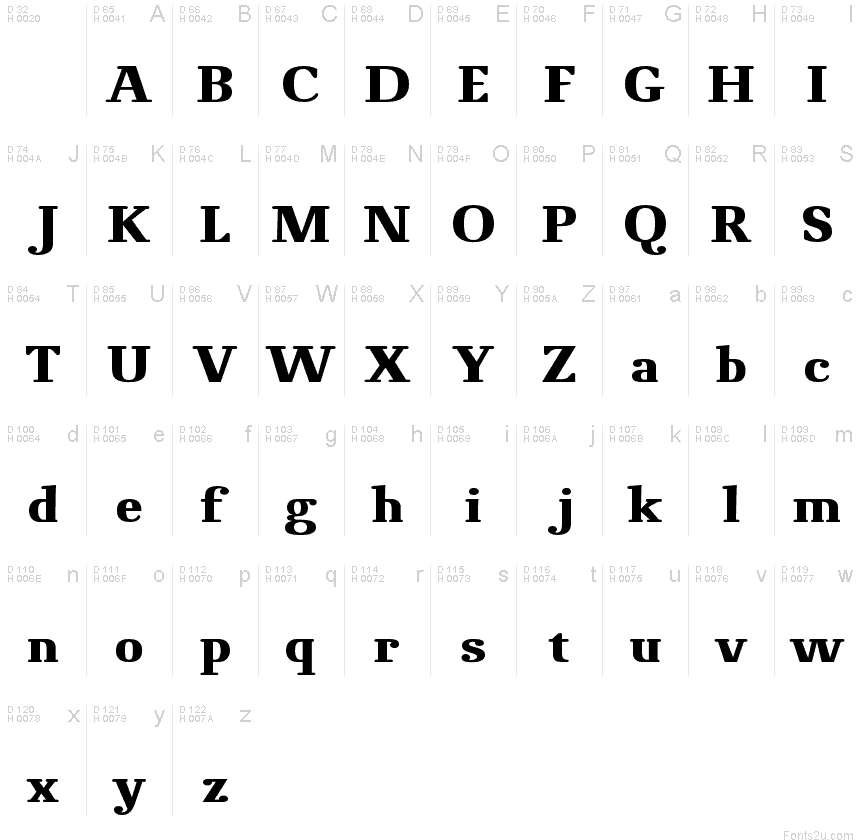
NovelloPro-Bold
OpenTypeデモアップデート完了
- アクセント (部分)
- アクセント (フル)
Novello_Pro_Bold.otf
タグ
著者の注記
A moderate Roman typeface with round serifs and modern details.
The goal in designing Novello Pro was to create a robust, usable Antiqua which would also print well on low-quality paper and would remain clearly legible even under adverse circumstances. In order to attain this goal, all the traditional unnecessary weight which justifiably could be disposed of was.
A bit of tradition remains in Novello Pro thanks to alternating thick and thin strokes. Basic character forms comply with what is generally considered the traditionally correct shape. The short round serifs are attached to the bodies of the letters at a right angle while the alternation of strokes follows a legitimate construction. The most striking characteristic of Novello Pro is the horizontal thin stroke as well as the joining in the stem on a, b, d, h n, m, p, q, r, and u. The typical gentle movement of the "upstroke" from the stem vanishes completely and is broken off so that a horizontal movement with emphasis on the right angle results on all of the aforementioned letters. In this way, unnecessary rounding off is avoided and the font leaves the impression of an almost modern sans serif type.
At ingoFonts all fonts can be downloaded. Gratis. Free.
Here's the catch: The files offered here to download contain only a reduced font. That means, the font only consists of uppercase and lowercase from A to Z or rather, a to z.
The complete font including numerals, umlauts, punctuation and especially ligatures is only available with your order and your cash.
文字マップ
このフォントに含まれる異なる文字マップを閲覧するには、プルダウンメニューを利用してください。

フォントの基本情報
著作権告示
Copyright (c) 2006 by ingoFonts Ingo Zimmermann. All rights reserved.
フォントファミリー
Novello Pro
フォントサブファミリー
Bold
ユニークサブファミリーID
ingoFontsIngoZimmermann: Novello Pro Bold: 2006
フルフォント名
NovelloPro-Bold
名称表バージョン
Version 1.002 2006
ポストスクリプトフォント名
NovelloPro-Boldreduced
登録商標告示
Novello Pro is a trademark of ingoFonts Ingo Zimmermann.
製造元
デザイナー
説明
Copyright (c) 2006 by ingoFonts Ingo Zimmermann. All rights reserved.
フォントの拡張情報
サポートされているプラットフォーム
プラットフォーム暗号化中
マイクロソフト全ユニコードレパートリー
ユニコード BMPのみ
マッキントッシュラテン語
ユニコードユニコード2.0 とオンワード・セマンティクス、ユニコードBMPのみ
フォントの詳細
作成完了2009-03-15
修正1
グリフカウント248
Emごとのユニット1000
埋め込み権利永続的インストール目的の埋め込み
ファミリークラスモダンセリフ
重さ太字(ボールド)
幅中程度(正常)
Mac仕様イタリック体
方向強い左右方向のグリフ、中立も含む
パターンの性質太字(ボールド)
完全版は、以下のリストに示された3フォントの重さを含んでいます。
Novello_Pro_Bold.otf
Novello_Pro_Normal.otf
Novello_Pro_Italic.otf
Novello_Pro_Normal.otf
Novello_Pro_Italic.otf
NovelloPro
OpenTypeデモアップデート完了
NovelloPro-Italic
OpenType個人使用