Obesum Caps ExtBlk Exp
TrueType個人使用
- ユーロ
Obesum-Caps-FFP.ttf
タグ
著者の注記
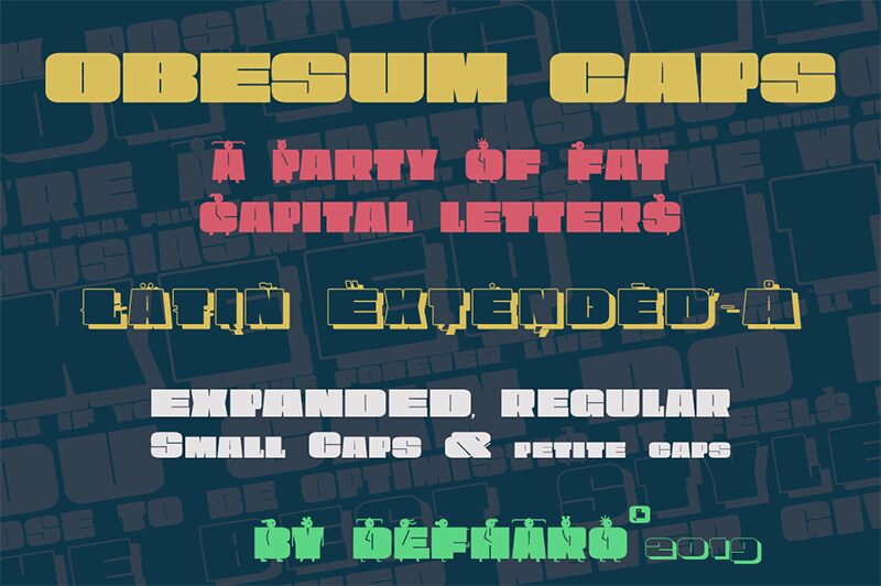
Obesum Caps is a very thick geometric display typeface with great contrast in the counterforms, it is made in homage to the capital letters and obese girls.
The font has five sets of uppercase letters: Capital letters are extended, lower case letters are more squares, and there is a version in small caps of a semi-expanded proportion, all of them with idiomatic support for Latin Extended-A, in addition to the standard alphabet and numbers in small size for the positions: Inferior, Denominator, Numerator and Superior, the letters and numbers have support for dynamic fractions and ordinals, besides the numbers have 3 different set: The normal numbering extended with the height of the capitals, old numbers to use with the small caps version of the letters and that have the height of the x and finally a third version of numbers for annotations.
I have enjoyed the forms and counterforms of this typeface so much that I have drawn an alternate alphabet to the tiny letters with figures of very sophisticated obese girls that are going to party, I hope you like it.
==============
FULL VERSIONS & LICENSES: https://defharo.com/fonts/obesum-ultra-caps/
文字マップ
このフォントに含まれる異なる文字マップを閲覧するには、プルダウンメニューを利用してください。

フォントの基本情報
著作権告示
Copyright (c) 2019 by deFharo. All rights reserved.
フォントファミリー
Obesum Caps ExtBlk Exp
フォントサブファミリー
Regular
ユニークサブファミリーID
Version 1.196;DFHA;ObesumCaps-ExtraBlackExpanded;2019;FLVI-613
フルフォント名
Obesum Caps ExtBlk Exp
名称表バージョン
Version 1.196
ポストスクリプトフォント名
ObesumCaps-ExtraBlackExpanded
登録商標告示
Obesum Caps is a trademark of deFharo.
製造元
デザイナー
説明
Obesum Caps is a very thick geometric typeface with great contrast in the counterforms, it is made in homage to the capital letters and obese girls. The font has five sets of uppercase letters: Capital letters are extended, lower case letters are more squares, and there is a version in small caps of a semi-expanded proportion, all of them with idiomatic support for Latin Extended-A, in addition to the standard alphabet and numbers in small size for the positions: Inferior, Denominator, Numerator and Superior, the letters and numbers have support for dynamic fractions and ordinals, besides the numbers have 3 different set: The normal numbering extended with the height of the capitals, old numbers to use with the small caps version of the letters and that have the height of the x and finally a third version of numbers for annotations.
I have enjoyed the forms and counterforms of this typeface so much that I have drawn an alternate alphabet to the tiny letters with figures of very sophisticated obese girls that are going to party, I hope you like it.
I have enjoyed the forms and counterforms of this typeface so much that I have drawn an alternate alphabet to the tiny letters with figures of very sophisticated obese girls that are going to party, I hope you like it.
フォントの拡張情報
サポートされているプラットフォーム
プラットフォーム暗号化中
ユニコードユニコード2.0 とオンワード・セマンティクス、ユニコードBMPのみ
マッキントッシュラテン語
マイクロソフトユニコード BMPのみ
フォントの詳細
作成完了1969-12-31
修正1
グリフカウント189
Emごとのユニット1000
埋め込み権利埋め込み制限(禁止!)
ファミリークラスサンセリフ
重さ過度に太字(ウルトラボールド)
幅拡張
方向強い左右方向のグリフ、中立も含む
パターンの性質定期的に
ピッチモノスペースでない