Ode an Erik AH
TrueTypeGNU/GPLアップデート完了
- アクセント (部分)
- ユーロ
Ode-Erik.ttf
タグ
著者の注記
Ode an Erik, designed by FontGrube AH, is a striking brush-style typeface that exudes a captivating blend of vintage charm and modern flair. Inspired by the title graphics of classic German TV police series from the 1960s and 70s, this font boasts a bold, expressive personality that commands attention. Its robust strokes and dynamic curves convey a sense of movement and energy, evoking a feeling of intensity and drama.
This versatile font lends itself beautifully to a wide range of design applications, from bold headlines and impactful branding to eye-catching signage and captivating editorial pieces. Its strong character and multi-language support make Ode an Erik an excellent choice for projects that require a distinctive, attention-grabbing typographic treatment.
This versatile font lends itself beautifully to a wide range of design applications, from bold headlines and impactful branding to eye-catching signage and captivating editorial pieces. Its strong character and multi-language support make Ode an Erik an excellent choice for projects that require a distinctive, attention-grabbing typographic treatment.

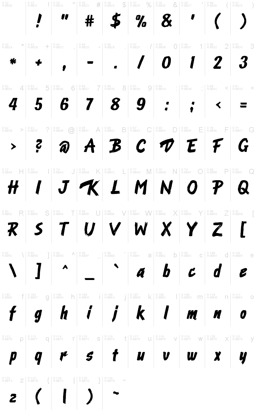
文字マップ
このフォントに含まれる異なる文字マップを閲覧するには、プルダウンメニューを利用してください。

フォントの基本情報
著作権告示
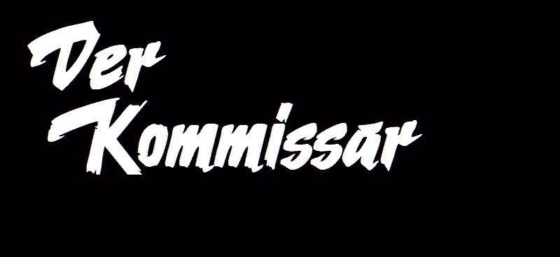
Nach dem Logo der Krimiserie "Der Kommissar" mit Erik Ode
フォントファミリー
Ode an Erik AH
フォントサブファミリー
Regular
ユニークサブファミリーID
Ode an Erik AH
フルフォント名
Ode an Erik AH
名称表バージョン
Version 2.00
ポストスクリプトフォント名
OdeanErikAH
製造元
Fontgrube AH
説明
This typeface originates in the Title graphics of the German TV police series "Der Kommissar" (The Police Commissioner) broadcast in 1969 to 1976.
The graphic title consists of fast, bold brush strokes and was hand-made. The letters were scanned and digitized, and from that material almost all of the lowercase characters could be derived. Uppercase and figures took inspiration from other sources which were adapted to fit the general character of the typeface.
The font works with many (mainly West-)European languages, such as English, German, French, Spanish, Italian, Portuguese, Danish, Swedish, Norwegian, Islandic and Turkish.
The name of the font alludes to the actor who played the main charakter, Erik Ode. In English it means "Ode to Erik".
ライセンス
Ode an Erik AH is available as a free font under the SIL Open Font License with the reserved name “Ode an Erik”. For details see https://scripts.sil.org/OFL
ライセンスのURL
フォントの拡張情報
サポートされているプラットフォーム
プラットフォーム暗号化中
ユニコードユニコード1.0セマンティクス
マッキントッシュラテン語
マイクロソフトユニコード BMPのみ
フォントの詳細
作成完了2024-04-24
修正1
グリフカウント230
Emごとのユニット1000
埋め込み権利永続的インストール目的の埋め込み
ファミリークラススクリプト
重さ太字(ボールド)
幅中程度(正常)
幅のタイプ通常
Mac仕様ボールド体
方向強い左右方向のグリフ、中立も含む
パターンの性質イタリック
傾き通常
ストロークの重さ中
ピッチモノスペースでない
記号セットWindows 3.1 ANSI