ZookyZooky
TrueType個人使用
ZookyZooky.ttf
タグ
著者の注記
Setting type has been an occupation and a passion of mine over the last 30 years. After completing some schooling at Cooper School of Art in Downtown Cleveland I accepted a position at Peto's Type House. Back then, the Cleveland Press still set type with 'Hot' lead. I know, I know, this dates me, but the facts are the facts. PhotoType was in it's infancy with the Linotronic 5700 being top-of-the-line technology in Photo type setting. My job at Peto's was more modest, among other things, I was hired to set headline type on what was called a 'Typositor'. It was still photo type setting but for headlines only. Letters had to be set (exposed), one letter at a time. A single headline of lets say15 words or so could take an hour or two to completely finish for paste-up, that's right, I said paste-up. That should really date me!! By doing this day in and day out (for hours on end) I gained a "close-up' appreciation for letterforms and spacing. Ernie Peto would also quiz me on identifying type by name. It was an interesting 18 months to say the least. There have been lasting effects on my appreciation of letterforms thanks to this experience.
Over the years, there have been spin offs of wood type, Times Roman, Helvetica, etc. Seems to me like we are just going over the same ground over and over and over again. What interests me is not the 'sameness' in the letterforms or their 'invisibility' in the graphics world. Some fonts are used to be 'invisible'. What I mean by this is that they are merely a communication tool to deliver the authors' / writers' message. the artistry in the forms lies in their ability to stay invisible and be easy to read.
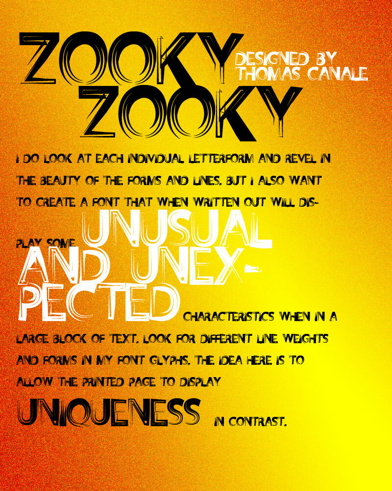
But their 'uniqueness' and how that difference translates to the printed page. There are many ways of looking at letterforms. We can look at the beauty of the individual letters themselves. Commenting on the curves of a upper case 'A' or a lower case letterform. Or we can look at them as a 'unit' and how that translates within a block of written text. It is this uniqueness that I am looking for in the fonts I design.
I do look at each individual letterform and revel in the beauty of the forms and lines. But I also want to create a Font that when written out will display some unusual and unexpected characteristics when in a large block of text. Look for different line weights and forms in my font glyphs. The idea here is to allow the printed page to display uniqueness in contrast.
Over the years, there have been spin offs of wood type, Times Roman, Helvetica, etc. Seems to me like we are just going over the same ground over and over and over again. What interests me is not the 'sameness' in the letterforms or their 'invisibility' in the graphics world. Some fonts are used to be 'invisible'. What I mean by this is that they are merely a communication tool to deliver the authors' / writers' message. the artistry in the forms lies in their ability to stay invisible and be easy to read.
But their 'uniqueness' and how that difference translates to the printed page. There are many ways of looking at letterforms. We can look at the beauty of the individual letters themselves. Commenting on the curves of a upper case 'A' or a lower case letterform. Or we can look at them as a 'unit' and how that translates within a block of written text. It is this uniqueness that I am looking for in the fonts I design.
I do look at each individual letterform and revel in the beauty of the forms and lines. But I also want to create a Font that when written out will display some unusual and unexpected characteristics when in a large block of text. Look for different line weights and forms in my font glyphs. The idea here is to allow the printed page to display uniqueness in contrast.
文字マップ
このフォントに含まれる異なる文字マップを閲覧するには、プルダウンメニューを利用してください。

フォントの基本情報
著作権告示
©THOMAS CANALE, CANALE STUDIO, INC.
フォントファミリー
ZookyZooky
フォントサブファミリー
ZookyZooky
ユニークサブファミリーID
1.000;pyrs;ZookyZooky
フルフォント名
ZookyZooky
ポストスクリプトフォント名
ZookyZooky
製造元
THOMAS CANALE
デザイナー
©THOMAS CANALE 2011
説明
Setting type has been an occupation and a passion of mine over the last 30 years. After completing some schooling at Cooper School of Art in Downtown Cleveland I accepted a position at Peto's Type House. Back then, the Cleveland Press still set type with 'Hot' lead. I know, I know, this dates me, but the facts are the facts. PhotoType was in it's infancy with the Linotronic 5700 being top-of-the-line technology in Photo type setting. My job at Peto's was more modest, among other things, I was hired to set headline type on what was called a 'Typositor'. It was still photo type setting but for headlines only. Letters had to be set (exposed), one letter at a time. A single headline of lets sayÉ15 words or so could take an hour or two to completely finish for paste-up, that's right, I said paste-up. That should really date me!! By doing this day in and day out (for hours on end) I gained a "close-up' appreciation for letterforms and spacing. Ernie Peto would also quiz me on identifying type by name. It was an interesting 18 months to say the least. There have been lasting effects on my appreciation of letterforms thanks to this experience.
Over the years, there have been spin offs of wood type, Times Roman, Helvetica, etc. Seems to me like we are just going over the same ground over and over and over again. What interests me is not the 'sameness' in the letterforms or their 'invisibility' in the graphics world. Some fonts are used to be 'invisible'. What I mean by this is that they are merely a communication tool to deliver the authors' / writers' message. the artistry in the forms lies in their ability to stay invisible and be easy to read.
But their 'uniqueness' and how that difference translates to the printed page. There are many ways of looking at letterforms. We can look at the beauty of the individual letters themselves. Commenting on the curves of a upper case 'A' or a lower case letterform. Or we can look at them as a 'unit' and how that translates within a block of written text. It is this uniqueness that I am looking for in the fonts I design.
I do look at each individual letterform and revel in the beauty of the forms and lines. But I also want to create a Font that when written out will display some unusual and unexpected characteristics when in a large block of text. Look for different line weights and forms in my font glyphs. The idea here is to allow the printed page to display uniqueness in contrast.
フォントの拡張情報
サポートされているプラットフォーム
プラットフォーム暗号化中
マイクロソフトユニコード BMPのみ
マッキントッシュラテン語
ユニコードユニコード2.0 とオンワード・セマンティクス、ユニコードBMPのみ
フォントの詳細
作成完了2011-08-17
修正1
グリフカウント101
Emごとのユニット1000
埋め込み権利プレビューと印刷目的の埋め込みの可
ファミリークラス無
重さ中程度(正常)
幅中程度(正常)
Mac仕様ボールド体
方向強い左右方向のグリフ、中立も含む
パターンの性質定期的に
ピッチモノスペースでない