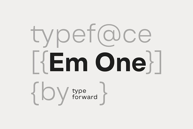
Em One SemiBold
TrueTypeフリーウェア
- アクセント (部分)
- アクセント (フル)
- ユーロ
EmOne-SemiBold.ttf
タグ
著者の注記
Em One SemiBold font by Type Forward Foundry embodies clean, modern aesthetics with minimalist and geometric influences. This free sans serif font is a sophisticated addition to any design project, offering an elegant simplicity that easily catches the eye. Em One SemiBold is characterized by straight cuts, smooth angles, low contrast between strokes, and a rectangular tail which are all unbelievably clear in their harmony of presentation.
Use this font for your banners, posters, greeting cards and invitations or include it in branding designs such as logos. Websites and mobile applications will also benefit from its clarity as will magazine/book/newspaper covers or body texts alike.
--
Get the full font:
https://www.typeforward.com/typefaces/em-one
Design Approach:
Em One is the first typeface developed in collaboration with our colleague Luboslav Boyanov, a graduate of the National Academy of Art Sofia. Our goal was to create a functional typeface with a broad range of applications, from web and print to branding, editorial work, and various design contexts. It embodies the distinctive character and aesthetics of classic Swiss typefaces while maintaining a straightforward design.
Distinct Features:
Key features of Em One include a tall x-height, minimal contrast between strokes, and moderate proportions that enhance readability. Refined letter spacing amplifies the overall appearance, while distinctive elements in some letters add character without introducing excessive visual noise. This balance makes Em One both versatile and aligned with graphic identity.
Font Family Composition:
Em One offers 9 weights ranging from Thin to Black, each accompanied by its italic version. It is available in refined OTF, TTF, and web font formats. Additionally, a variable font format provides greater flexibility for dynamic solutions.
Technical Specifications:
Designed for a broad audience, Em One supports over 220 languages, including extended Latin and Cyrillic scripts. It features an array of typographic options such as ligatures, stylistic sets, contextual alternatives, and various OpenType attributes.
Usage:
Em One is multifunctional and adaptable; its different weights can serve as standalone elements or complements within design systems. Thicker weights are ideal for headlines and display elements, while middleweights are optimized for text blocks. Designed for screen performance as well as print use, Em One effectively balances glyphs and negative space across all media.
Summary:
Em One is a practical sans-serif typeface inspired by popular Swiss designs from the mid-20th century. As a multipurpose font, it excels in both display contexts and functional applications while remaining recognizable and characterful throughout its usage.
文字マップ
このフォントに含まれる異なる文字マップを閲覧するには、プルダウンメニューを利用してください。

フォントの基本情報
フォントファミリー
Em One SemiBold
フォントサブファミリー
Regular
ユニークサブファミリーID
1.000;SPT;EmOne-SemiBold
フルフォント名
Em One SemiBold
名称表バージョン
Version 1.000
ポストスクリプトフォント名
EmOne-SemiBold
製造元
デザイナー
説明
Geometric Typeface
フォントの拡張情報
サポートされているプラットフォーム
プラットフォーム暗号化中
ユニコードユニコード2.0 とオンワード・セマンティクス、ユニコードBMPのみ
マイクロソフトユニコード BMPのみ
フォントの詳細
作成完了2024-08-23
修正1
グリフカウント609
Emごとのユニット1000
埋め込み権利プレビューと印刷目的の埋め込みの可
ファミリークラスサンセリフ
重さやや太字(セミボールド)
幅やや拡張
Mac仕様ボールド体
方向強い左右方向のグリフ、中立も含む
パターンの性質定期的に
ピッチモノスペースでない
完全版は、以下のリストに示された2フォントの重さを含んでいます。
EmOne-SemiBold.ttf
EmOne-SemiBoldItalic.ttf
EmOne-SemiBoldItalic.ttf
Em One SemiBold Italic
TrueTypeフリーウェア
